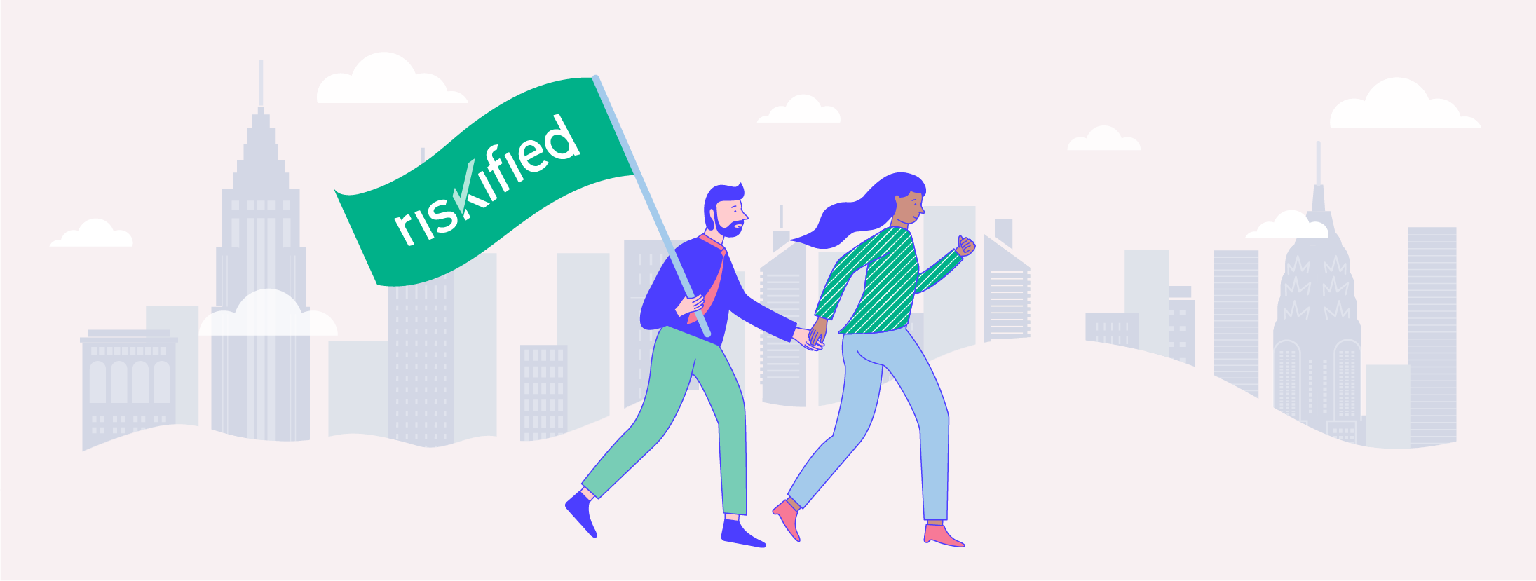
Introducing Riskified’s New Look
Riskified has a new look. We are a bigger, stronger, and more confident company today than we were eight years ago. We built a robust eCommerce risk management platform that powers multiple products, including our flagship solution, Chargeback Guarantee.
Today, three of the world’s 10 largest eCommerce merchants trust us to grow revenue, reduce operating costs, and mitigate fraud. We wanted a logo that communicated that. In this blog, we will share some of the ideas behind our new design.
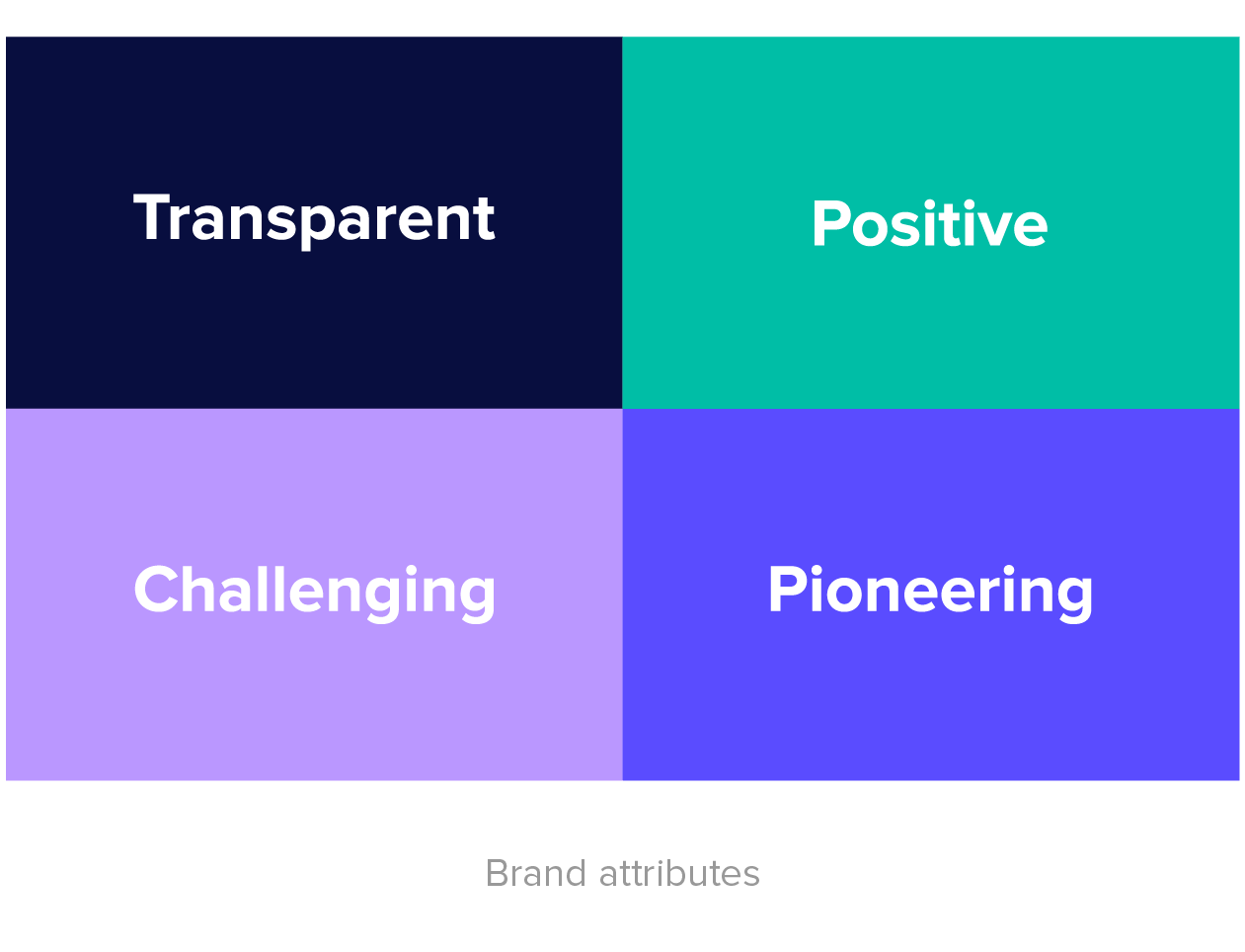
Green has been our main color from day one. Green = positivity, one of our core values. We think of fraud prevention as an engine of growth. This means that we don’t simply block bad actors, we empower merchants to safely approve more orders and grow their bottom line.
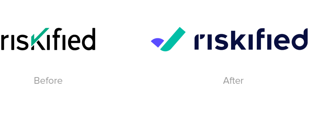
In our new logo, we expanded the color palette, echoing our expansion into new products and new markets. Our signature checkmark, which stands for all the orders we approve, has changed into a dynamic new symbol. It represents a company continuously on the move, and our commitment to drive our partners forward by supporting their growth.
From a different angle, our checkmark turns into the letter R. Free-standing, it is an abbreviated version of our logo.
Finally, our new logo is rounder and brighter. In design language, we say “friendlier.” It represents the Riskified team, the human talent powering the technology. It also represents our commitment to open communication and alignment of goals with our merchants, working together to offer better customer experiences.
Our logo is not the only thing we changed. We also have a new website, showcasing our evolving product offering. Having pioneered the Chargeback Guarantee model, today we continue to tackle the emerging challenges of the fast-moving global eCommerce landscape, from securing store accounts to enabling seamless payment.
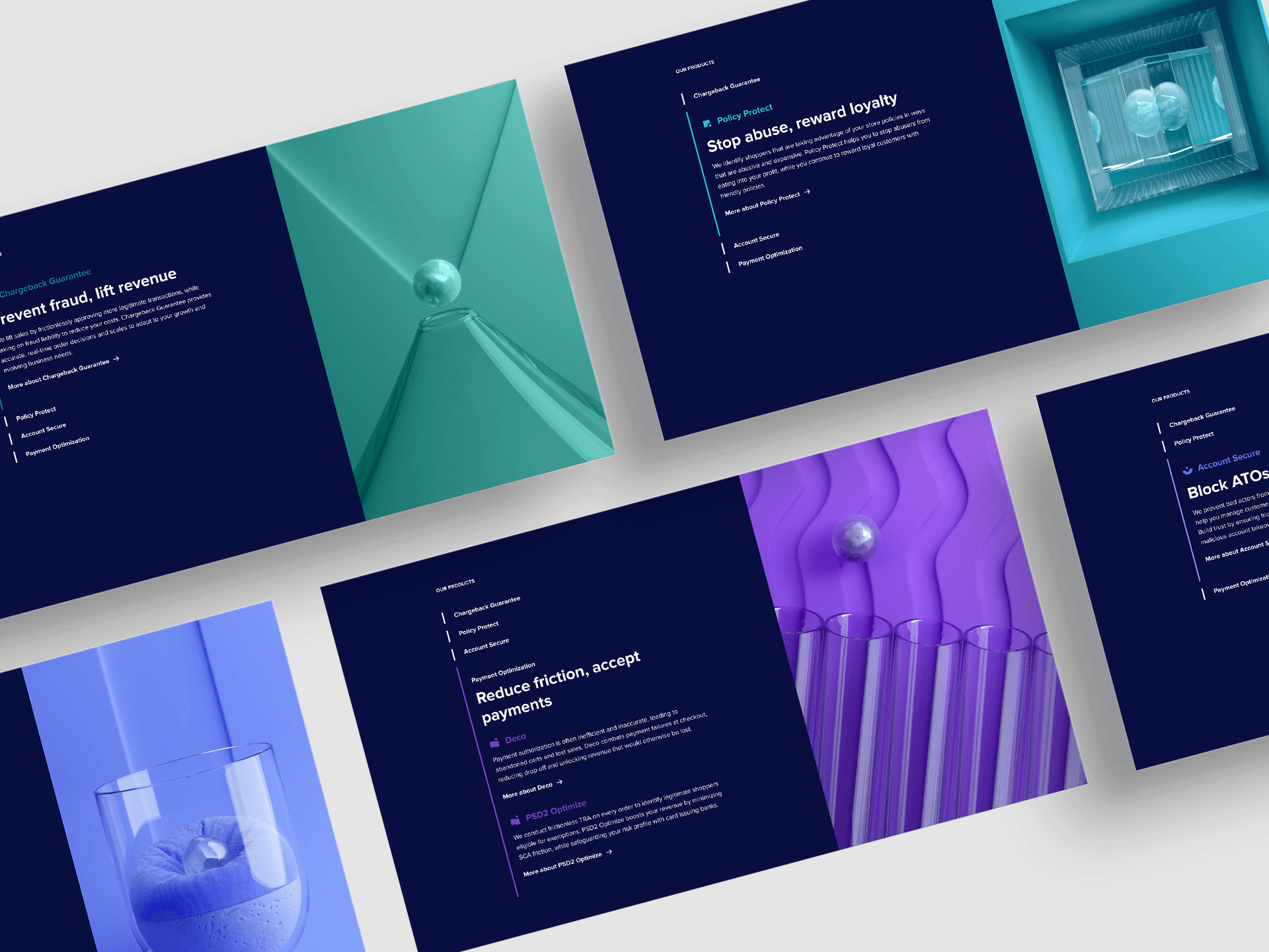
Working on this website, our design team was tasked with visually representing abstract concepts. What does a ‘machine learning-powered fraud prevention platform’ look like? And how about ‘frictionless customer experience?’ Check our new website to find out.